JG Admin Dashboard
Consolidating fragmented administration tools into a unified enterprise experience that improved discoverability, preserved familiar workflows, and established a scalable navigation foundation.
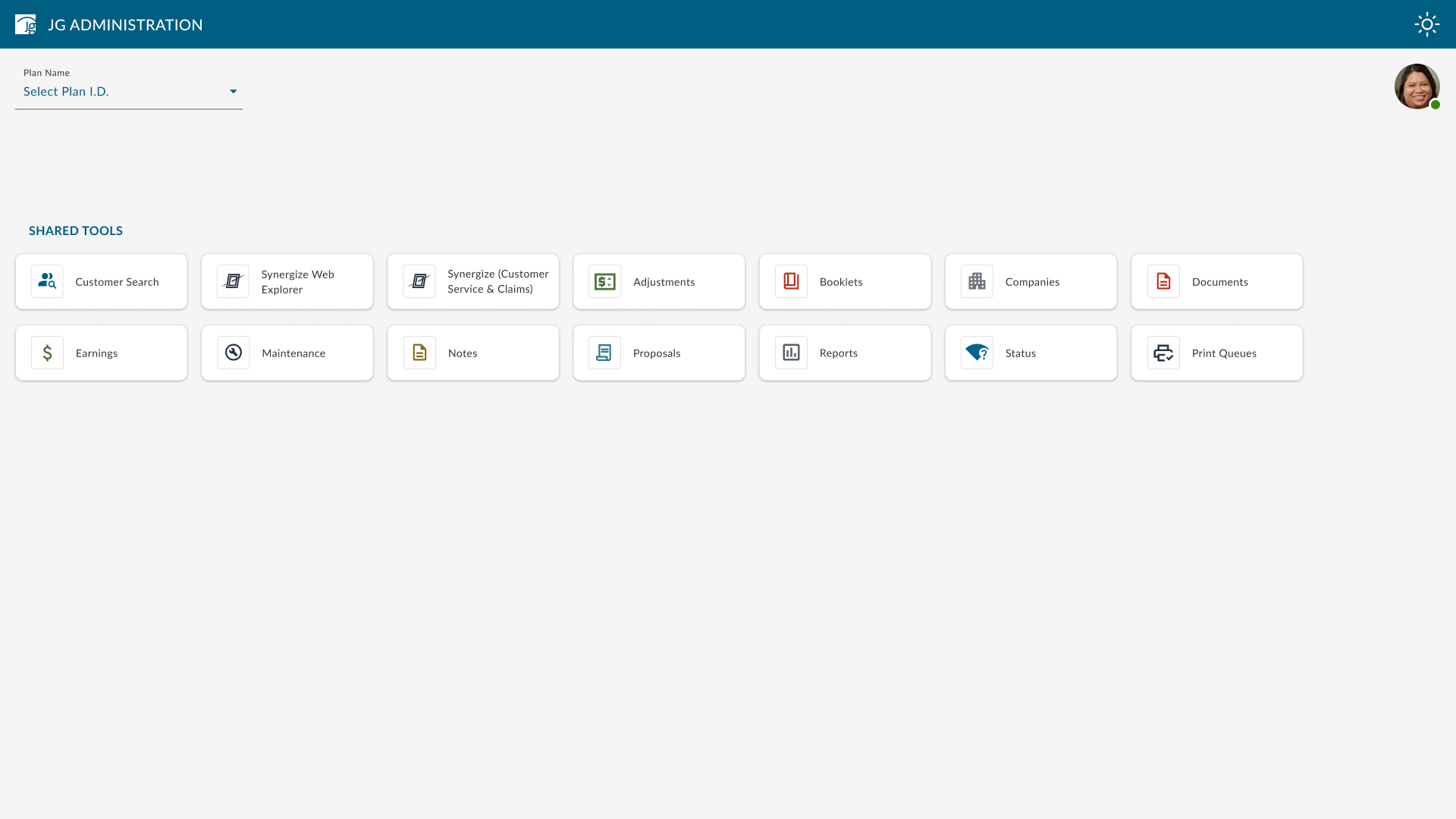
Creating one scalable entry point for a fragmented administration ecosystem.
Internal teams relied on a growing collection of disconnected administration tools, inconsistent entry points, and legacy navigation patterns. I shaped a unified dashboard and navigation model that made applications easier to recognize and access while preserving the context and familiarity users depended on in daily operations.
Goals
- Create one clear, role-aware entry point for administration applications.
- Improve application discoverability across a growing enterprise ecosystem.
- Reduce search effort and cognitive load through clearer grouping and progressive disclosure.
- Establish reusable navigation patterns for future platform modernization.
Expectations
- Support high-frequency users moving between multiple applications throughout the day.
- Preserve familiar mental models while improving cross-product consistency.
- Accommodate role-based access, plan context, and future application growth.
- Define reusable, accessible patterns that engineering could implement and extend.
Operational teams navigating high-volume benefits administration work.
Primary users included administrators, customer service teams, business specialists, and operational staff who moved repeatedly between applications to complete time-sensitive benefits work. Their success depended on fast recognition, predictable navigation, and maintaining plan and task context across systems.
MVP Strategy
The MVP deliberately focused on the highest-value layer: a unified dashboard, clearer application grouping, and a navigation model that could grow over time. This reduced delivery risk, preserved familiar task paths, and created a testable foundation before deeper legacy workflows were modernized.
Data-Driven Decisions
User feedback and stakeholder reviews indicated that recognition, clear grouping, and rapid access were more valuable than showing the full application inventory at once. I used that evidence to prioritize frequently used tools, progressive disclosure, and an information architecture that could scale without overwhelming users.
The challenge
- Disconnected applications, duplicated entry points, and inconsistent wayfinding
- Different navigation conventions and terminology across legacy tools
- Role-based visibility, plan context, and a large application inventory
- Modernization constraints that required continuity for established workflows
Strategic contributions
- Audited legacy workflows, application inventories, and stakeholder requirements to define the core navigation problem and align the team on a unified product direction.
- Mapped the application hierarchy, entry points, and return paths to reduce navigation ambiguity across a large enterprise toolset.
- Compared dashboard, chip, sidebar, and navigation-rail concepts against discoverability, scalability, familiarity, accessibility, and implementation feasibility.
- Built and iterated high-fidelity prototypes that made trade-offs tangible and helped product, business, and engineering stakeholders converge on an implementable direction.
Design rationale
I used familiar Material Design patterns to lower the learning curve, then adapted them to the organization’s plan-based context and role visibility. The resulting framework balanced recognition for current users with enough flexibility to support additional applications and future migration phases.
Collaboration and influence
I facilitated reviews around multiple navigation concepts, explicitly framing the trade-offs among discoverability, familiarity, screen density, accessibility, and development effort. Prototypes gave stakeholders a shared reference point and helped the team choose a direction based on user behaviour rather than preference alone.
The dashboard needed to reduce search effort and support recognition, not simply expose every available application.
Feedback favoured a chips-based dashboard because it made familiar applications easier to scan and grouped related work more clearly. The complementary navigation model then provided a scalable path to deeper tools without crowding the primary view.
Design Process
The work progressed from legacy-system analysis and requirements mapping to information architecture, concept comparison, stakeholder validation, and production-ready interaction design.
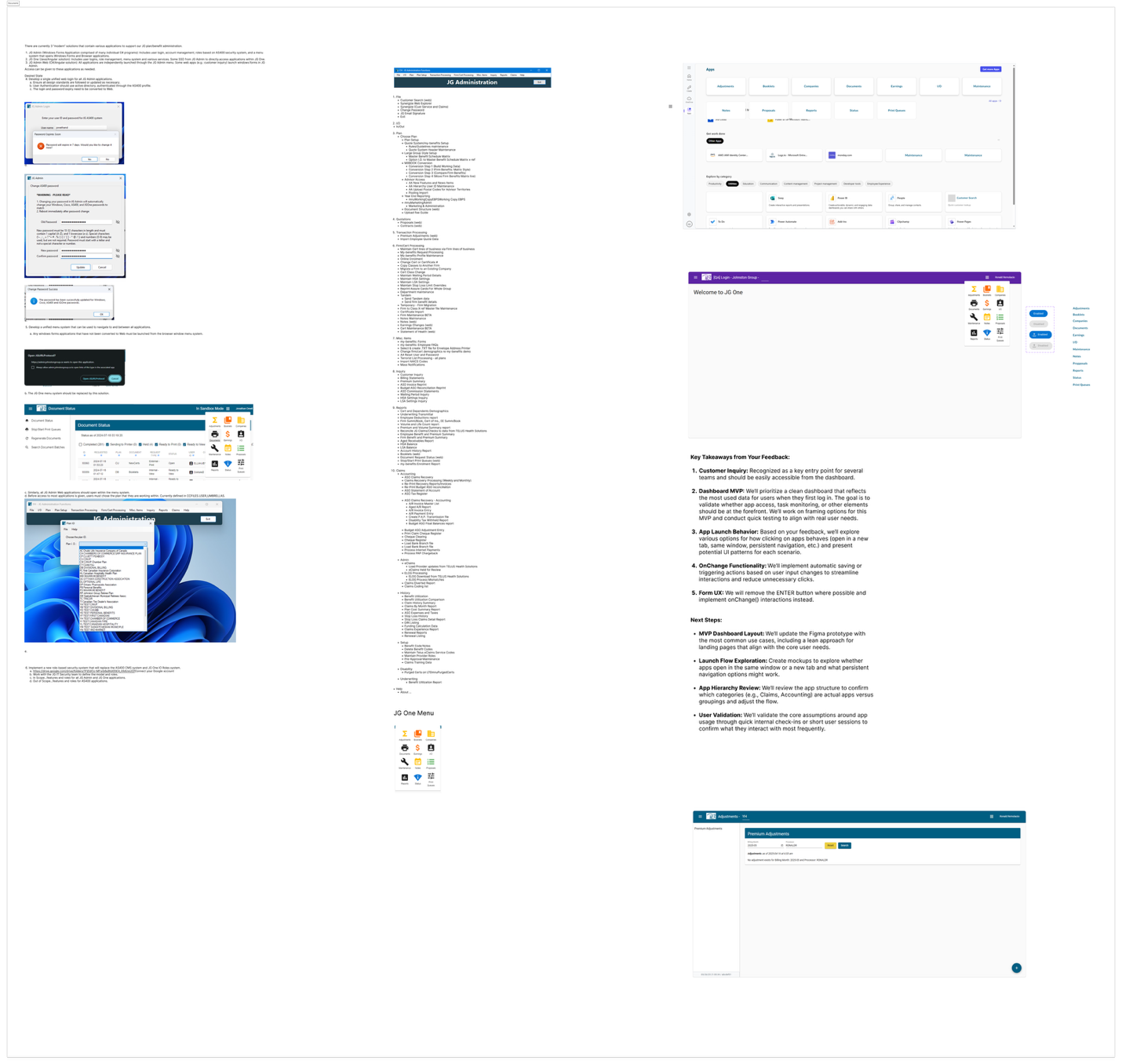
Legacy Review & Requirements Mapping
Reviewed legacy screens, application inventories, access behaviours, business documentation, user feedback, and stakeholder requirements to identify recurring navigation breakdowns and modernization constraints.
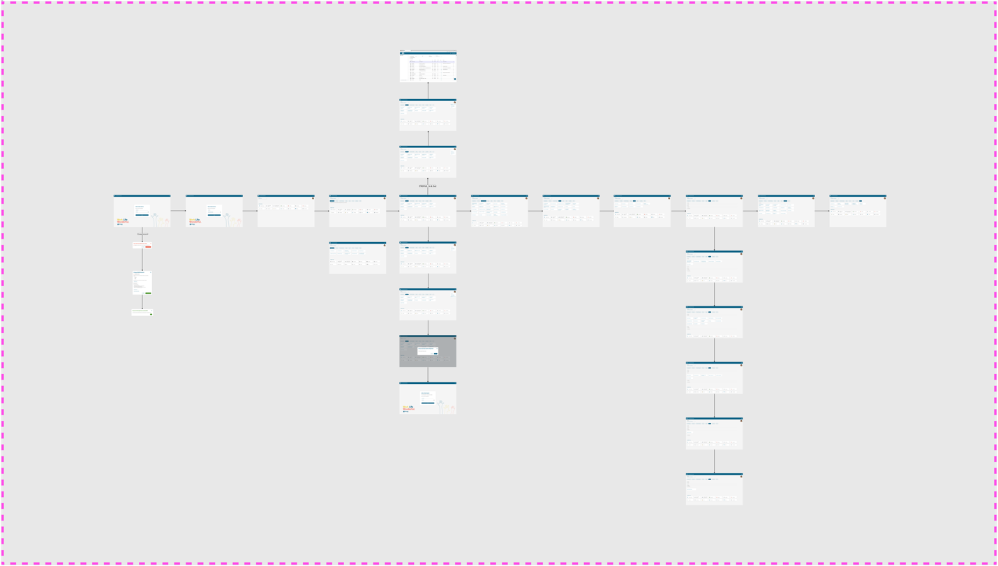
Information Architecture & Task Flow
Mapped key entry points, launch paths, account states, role visibility, and return journeys so the experience could support familiar daily tasks while accommodating future platform growth.
High-Fidelity Design Exploration
Explored how application categories, frequently used tools, plan context, shared tools, and account controls could coexist without competing for attention or weakening orientation.
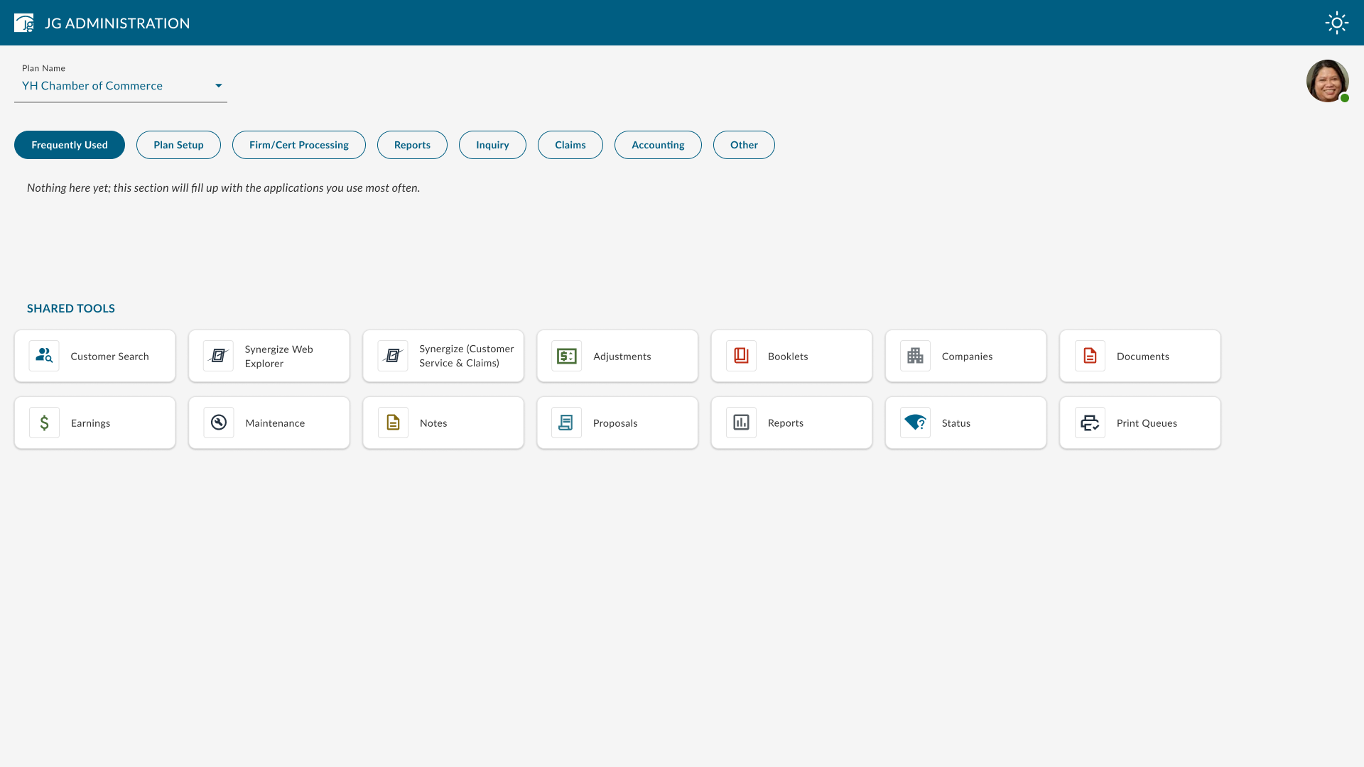
Final Production UI
Translated the approved direction into a production-ready dashboard with clearer grouping, visible plan context, reusable application patterns, and specifications that engineering could extend across future administration workflows.
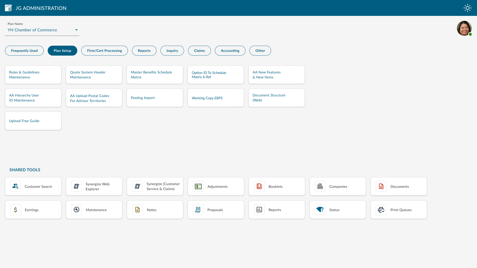
A clearer, scalable foundation for enterprise modernization.
The proposed experience established one coherent entry point for administration work, improved the recognizability of frequently used tools, and created reusable navigation patterns for future migration away from fragmented legacy systems. It also gave product and engineering teams a shared foundation for evaluating subsequent modernization work.
How success would be measured
Post-launch analytics were not yet available when I transitioned from the project, so these outcomes represent validated design intent rather than claimed production impact. Success should be evaluated through:
- Median time and task success rate for locating frequently used applications
- Navigation-related support volume and repeated wayfinding errors
- Adoption and repeat usage of the unified dashboard compared with legacy entry points