Discoverability
Members needed a clearer starting point for finding support based on their needs.
Transforming health and wellness discovery into a more intuitive, accessible, and scalable experience for Canadian plan members across web and mobile.
My Benefits supported claims, health services, wellness programs, provider resources, and personalized benefits. Over time, the experience accumulated dense navigation, inconsistent provider layouts, and accessibility issues that made it harder for members to know where to start.
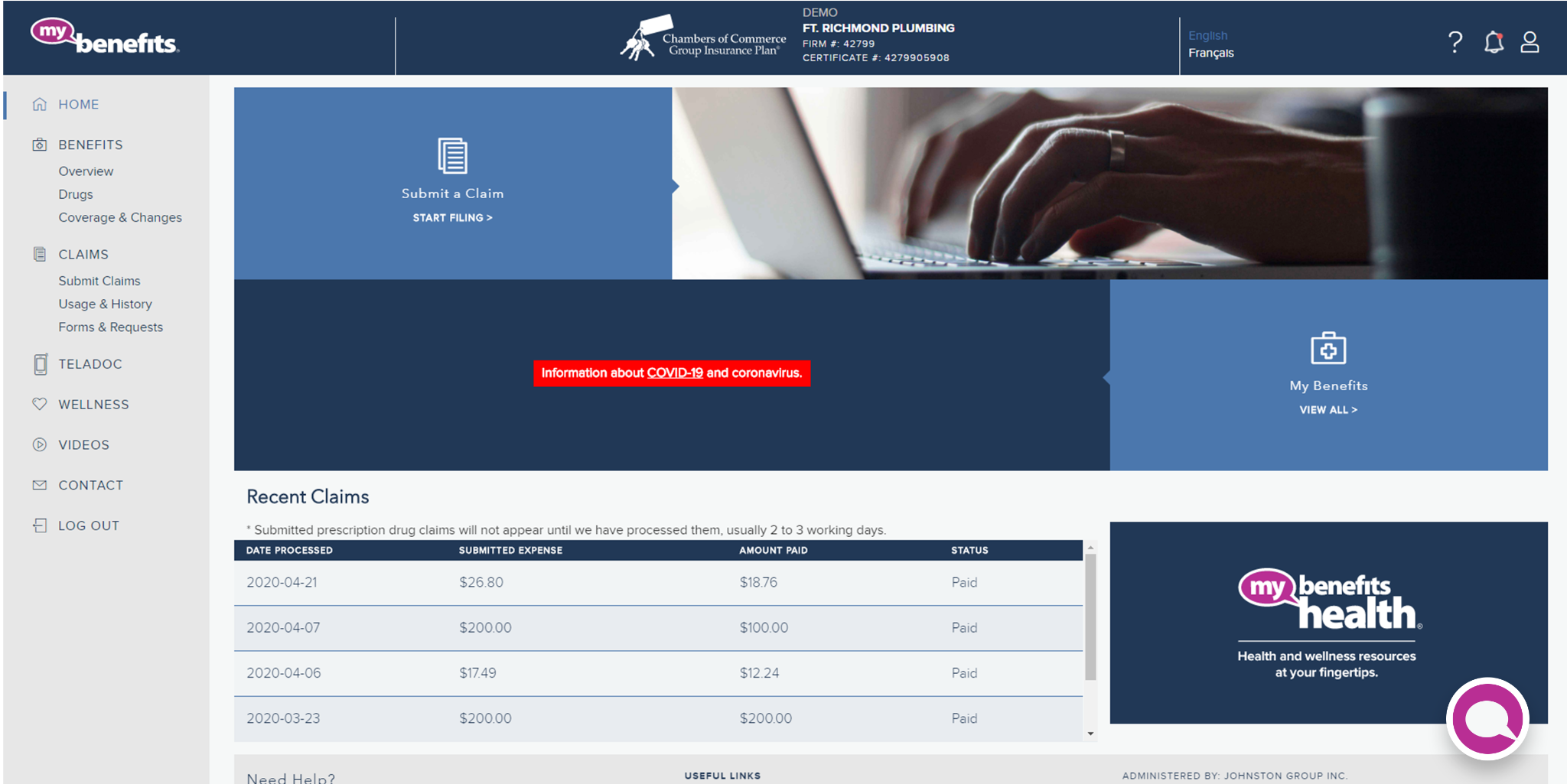
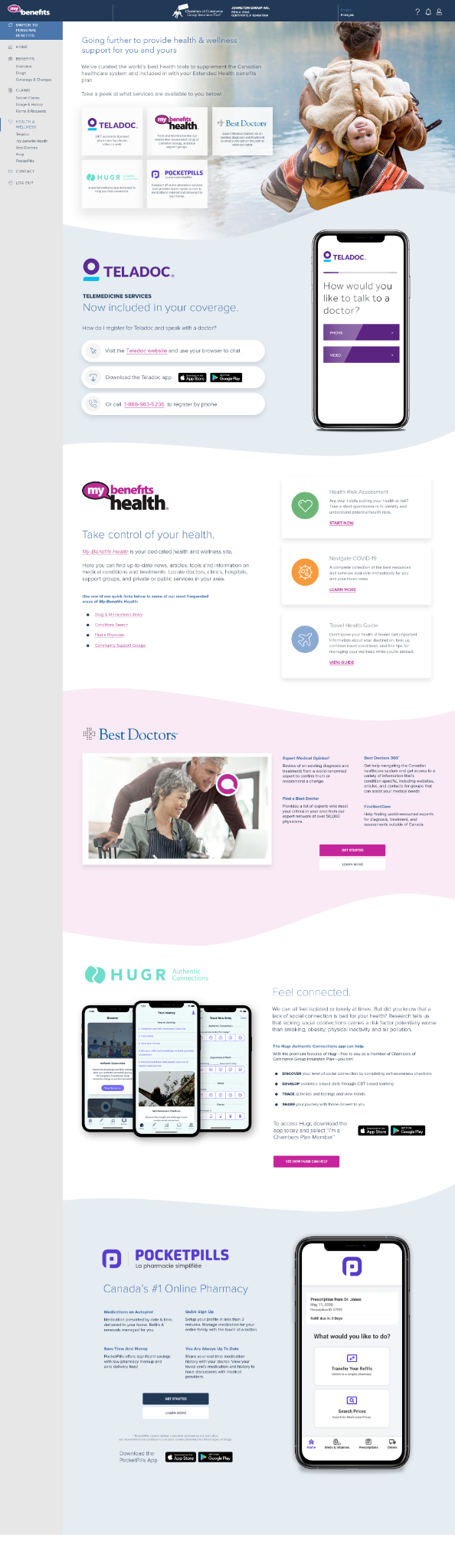
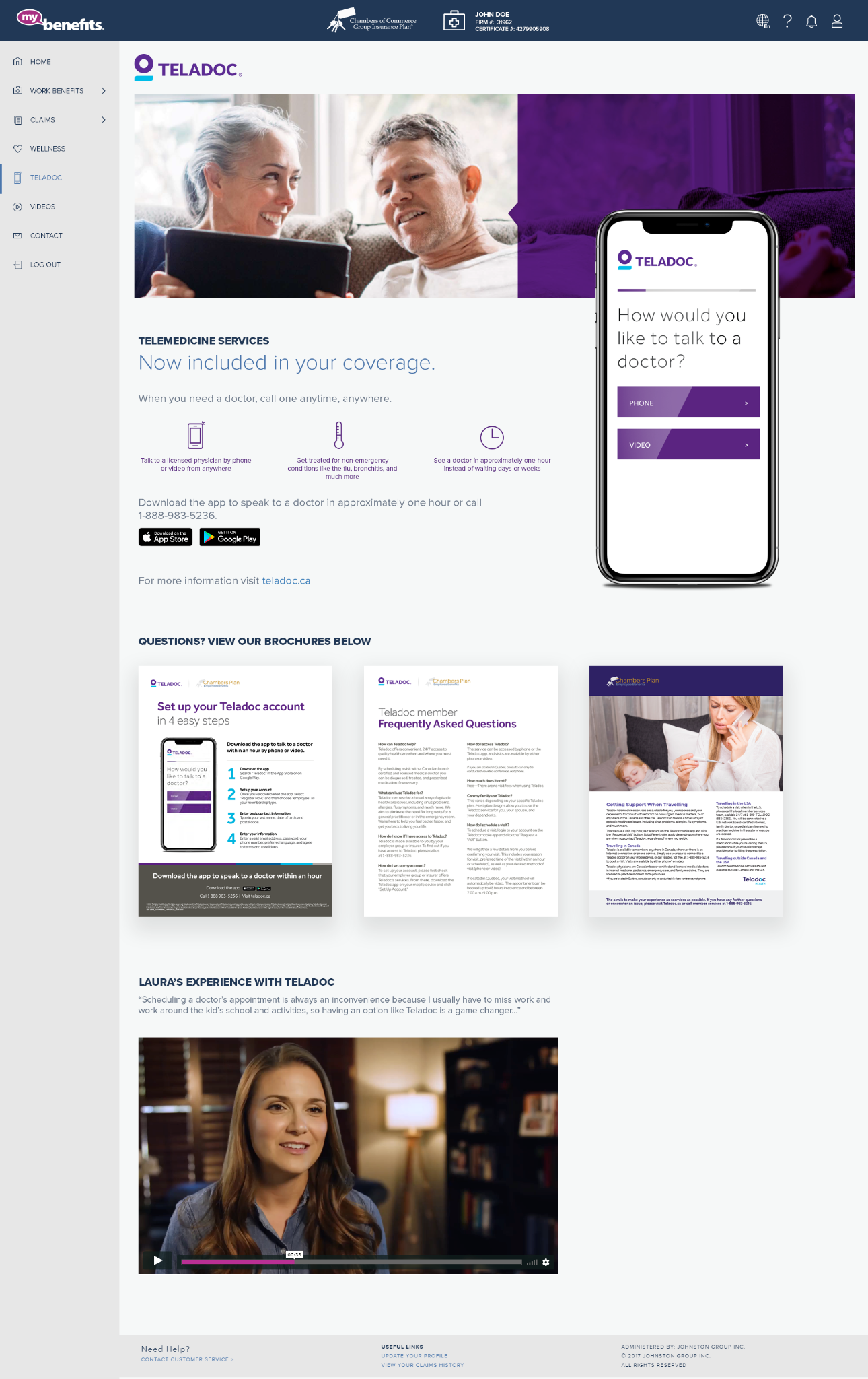
Members needed a clearer starting point for finding support based on their needs.
The navigation lacked a persistent active state, making it easier to lose location.
Low-contrast interface elements reduced readability and confidence.
Each new provider added content and maintenance complexity to the platform.
Working with product leadership and UX collaborators, I helped define a system that organized services around member needs rather than provider pages—while retaining the trusted My Benefits ecosystem.
Reduce information overload by organizing the ecosystem around understandable needs.
Support quick filtering, scanning, and direct navigation to relevant details.
Strengthen readability and maintain orientation throughout the journey.
Make future services, media, and rebrands easier to integrate consistently.
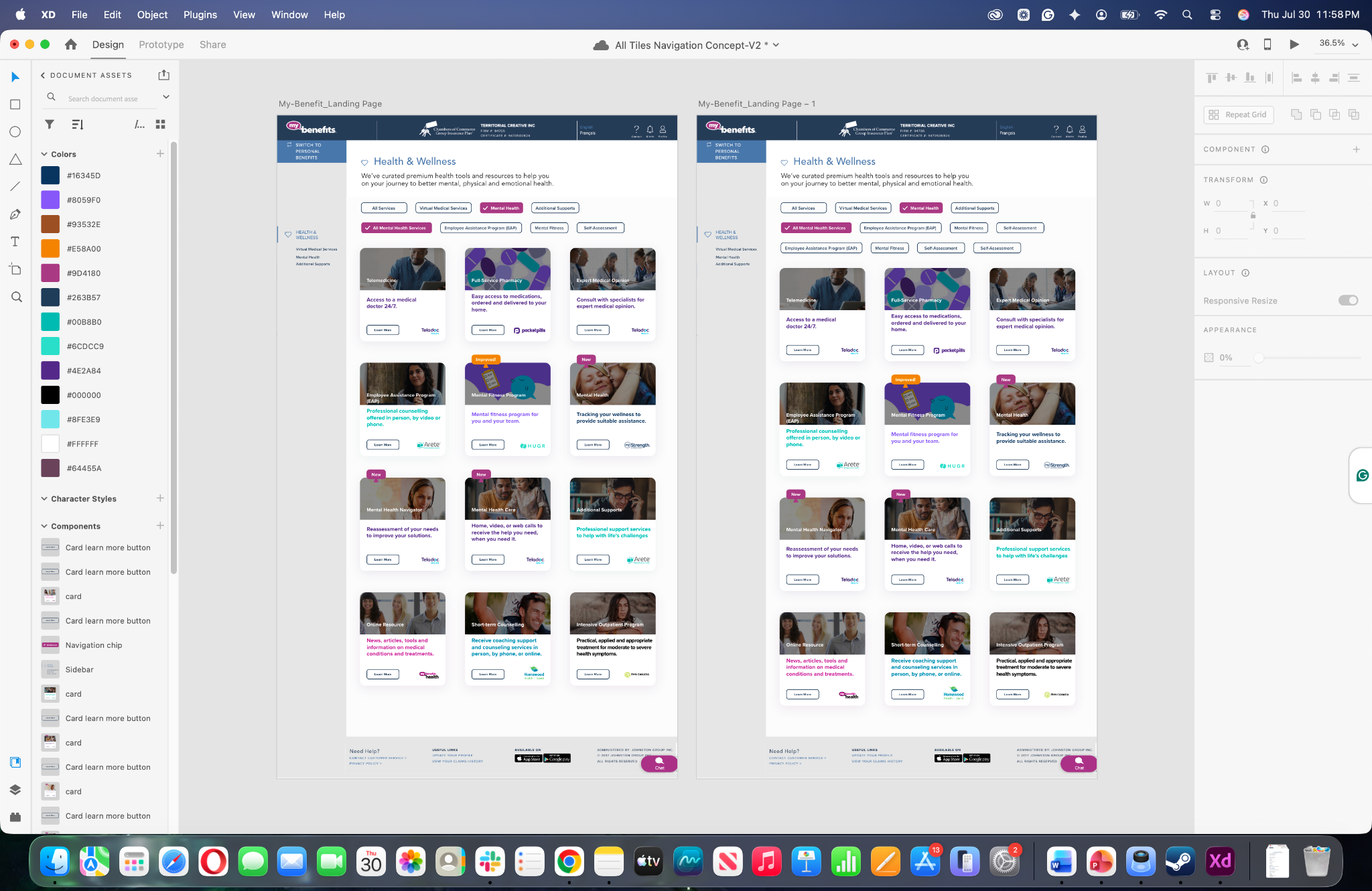
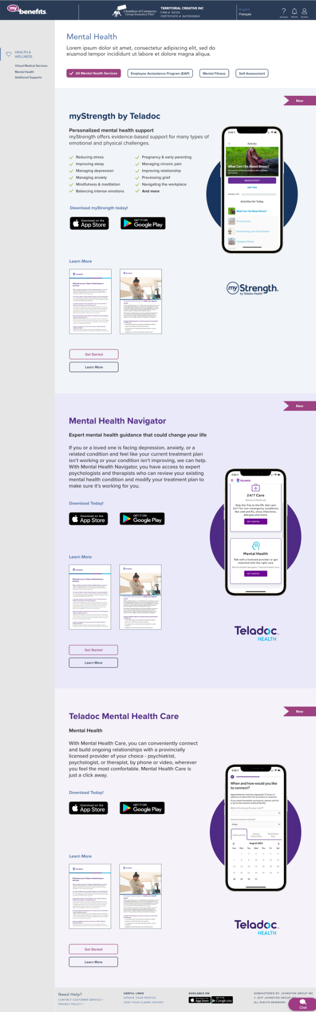
The web redesign replaced a long provider directory with clear categories, elevated cards, and direct paths to detailed content—preserving context while reducing search effort.
Elevated service tiles improve hierarchy and make options easier to compare.
Grouped chips let users move between categories without losing context.
Learn More deep-links each card to its matching benefit section.
Each provider section had to balance descriptions, app downloads, brochures, imagery, and conversion actions. A reusable responsive pattern established a predictable reading order across screen sizes.

The mobile journey preserves the full member context—from authentication and personalized home to Health & Wellness discovery—rather than presenting the feature as an isolated concept.
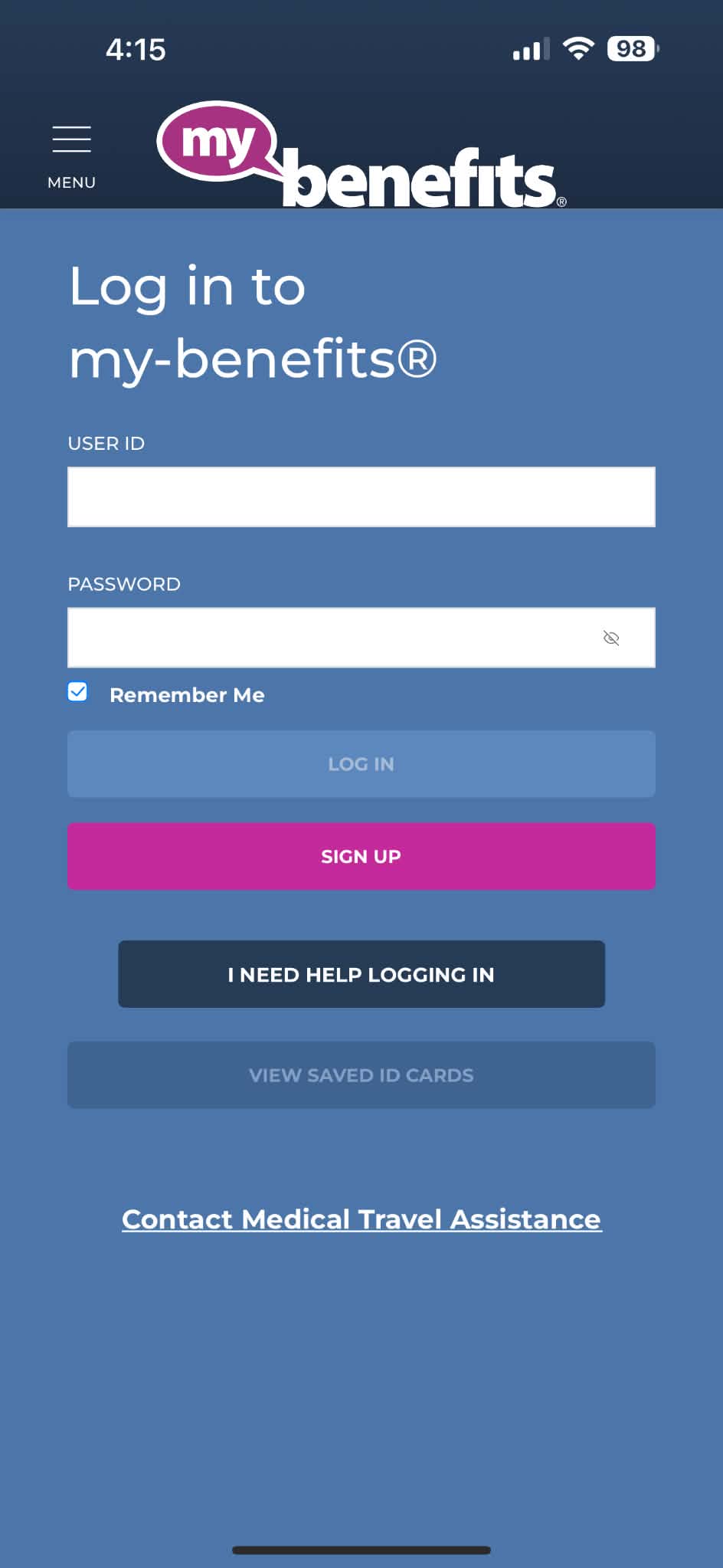
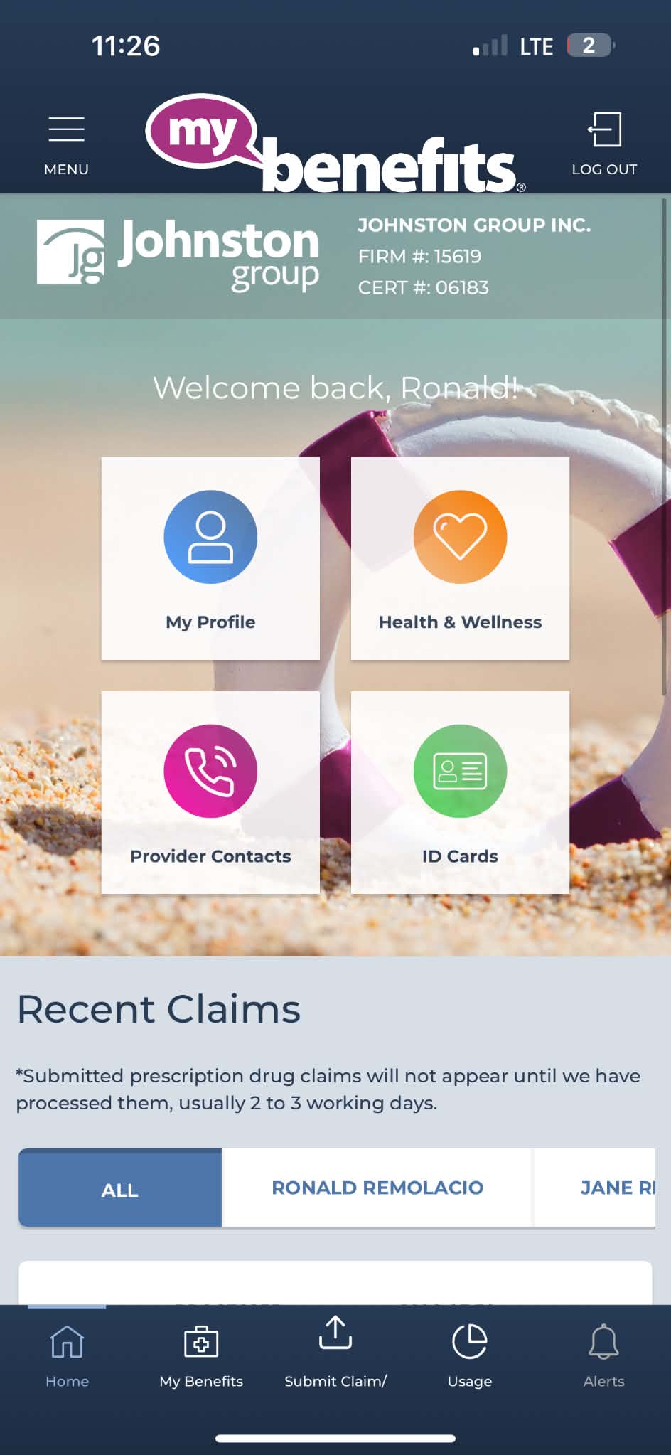
Members enter through a real authenticated journey.
Health & Wellness is visible as a primary destination.
Active states help users understand where they are.
Web and mobile share the same information architecture.
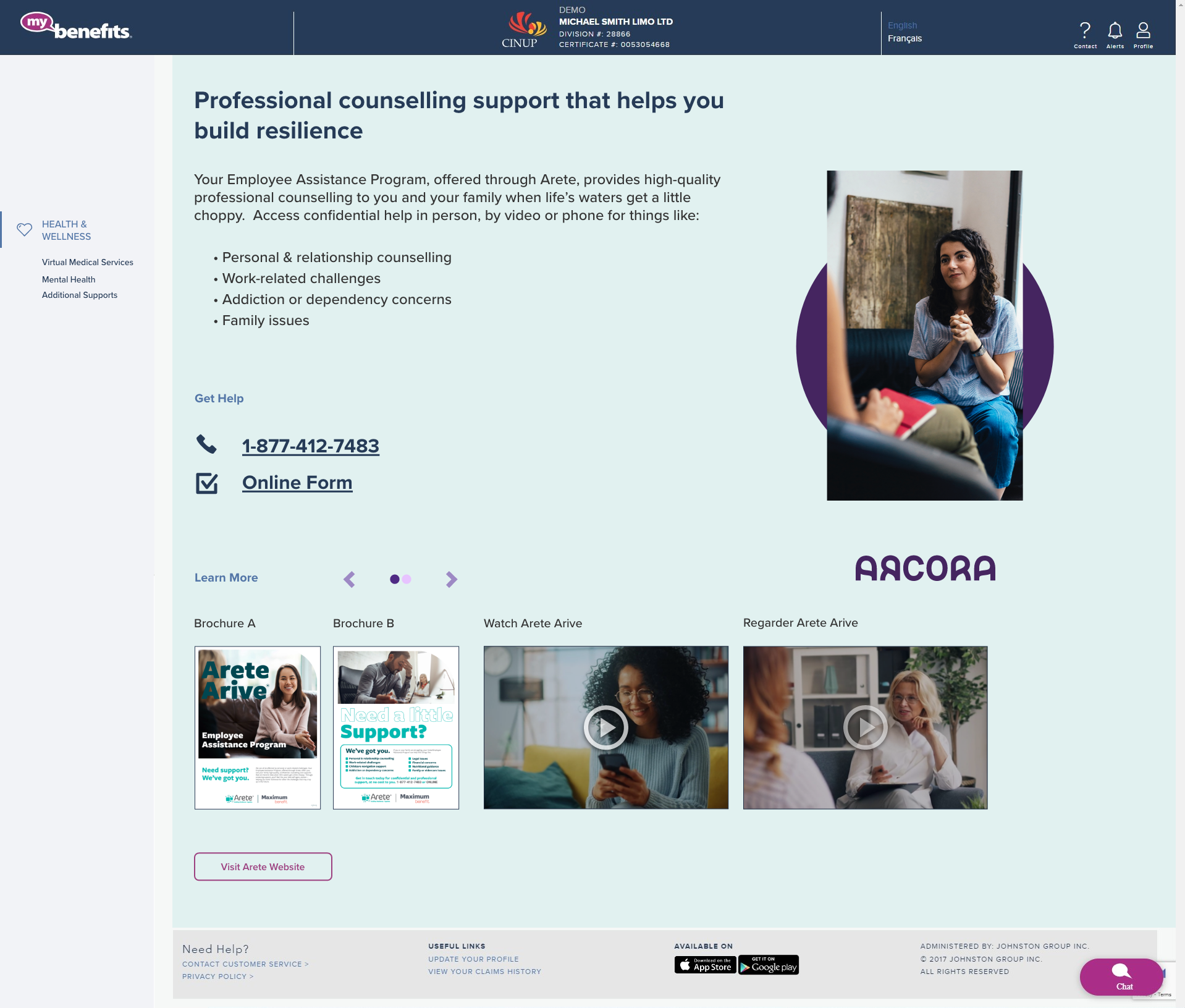
The work extended beyond a single landing page. Reusable provider sections supported contact actions, brochures, videos, app downloads, and future brand changes without disrupting the larger product structure.
The modular architecture allowed visual identity, contact paths, brochures, and media to evolve while preserving familiar interaction patterns for members.
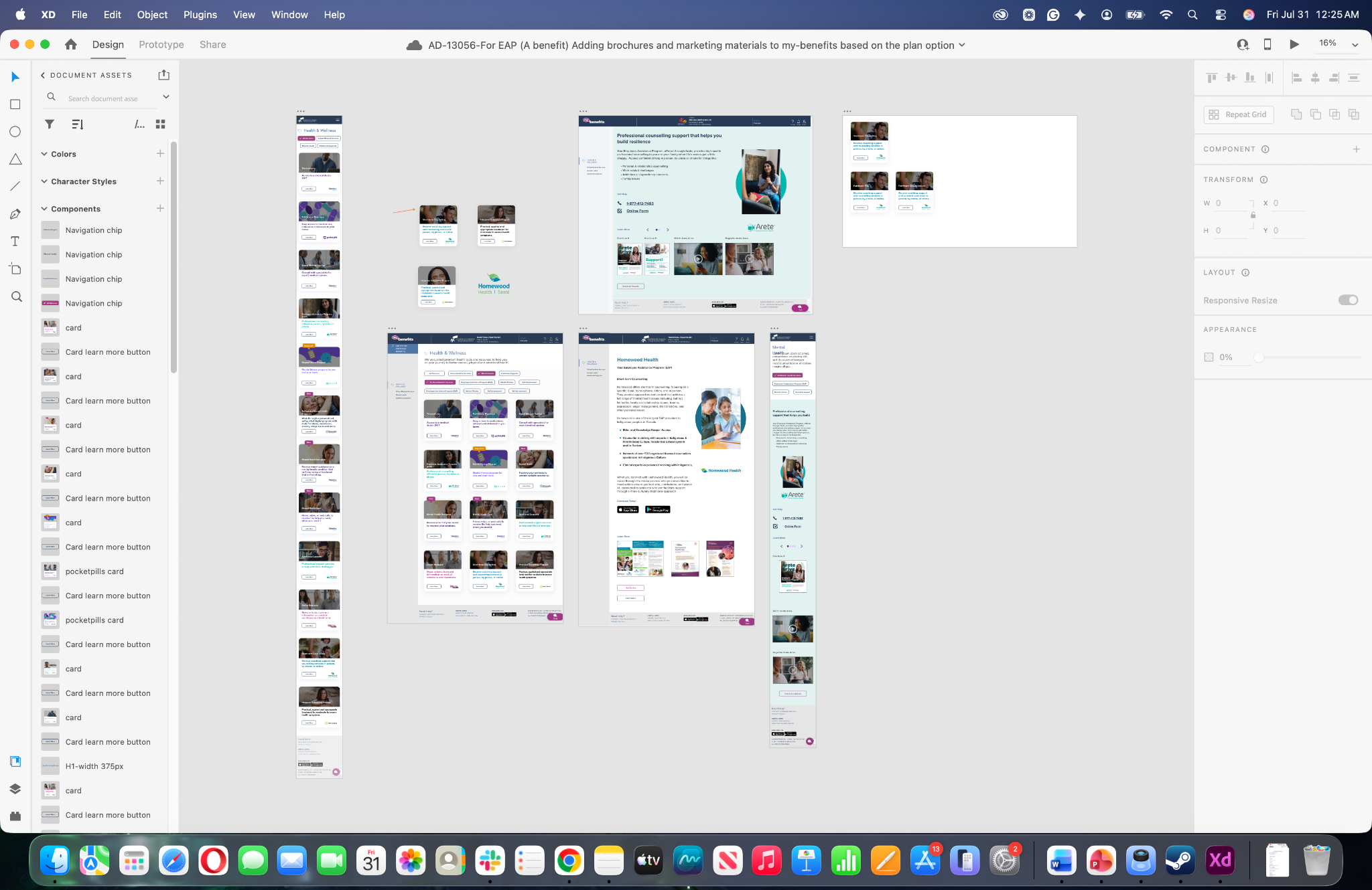
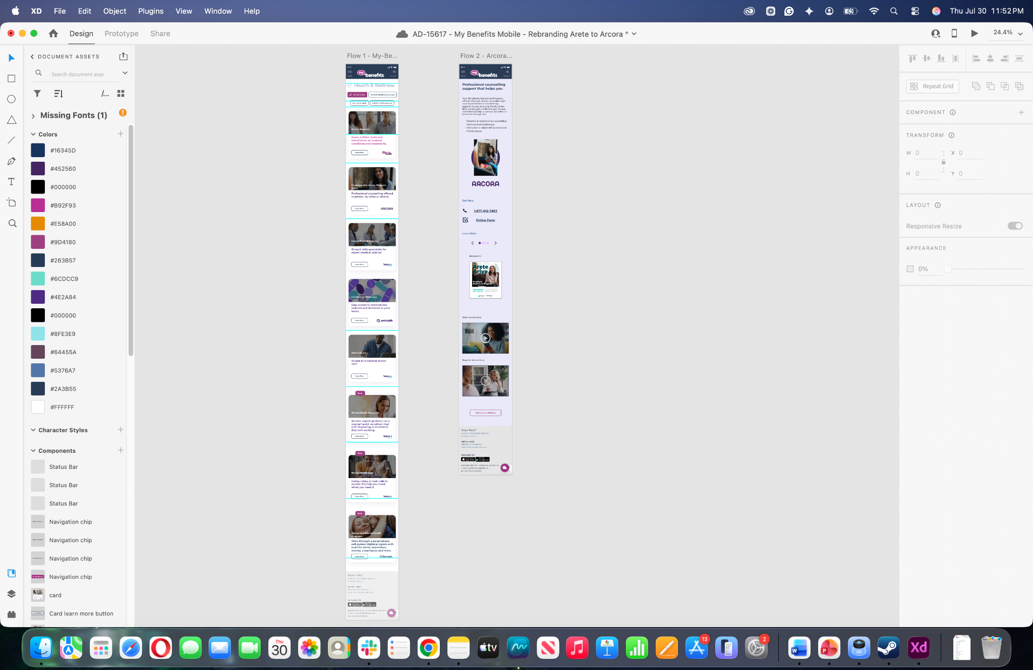
Categories, chips, and tiles established a clear starting point.
Deep links reduced manual searching through long pages.
Improved contrast, hierarchy, and active states strengthened usability.
Reusable modules supported future services, media, and rebrands.
The redesigned Health & Wellness experience was successfully launched as part of the My Benefits platform. The updated experience received positive feedback from management, business stakeholders, and users for its improved usability and streamlined navigation. During a cross-functional IT meeting, the Business Analyst publicly recognized the team's efforts and personally thanked me for my contributions to delivering a more intuitive member experience.
Designing enterprise health experiences is not only about presenting information. It is about helping people confidently find the support they need—often during important moments in their lives.