Statement of Health
Translating complex health, dependent, privacy, and eligibility rules into a guided application that helped members understand progress, requirements, and next steps.
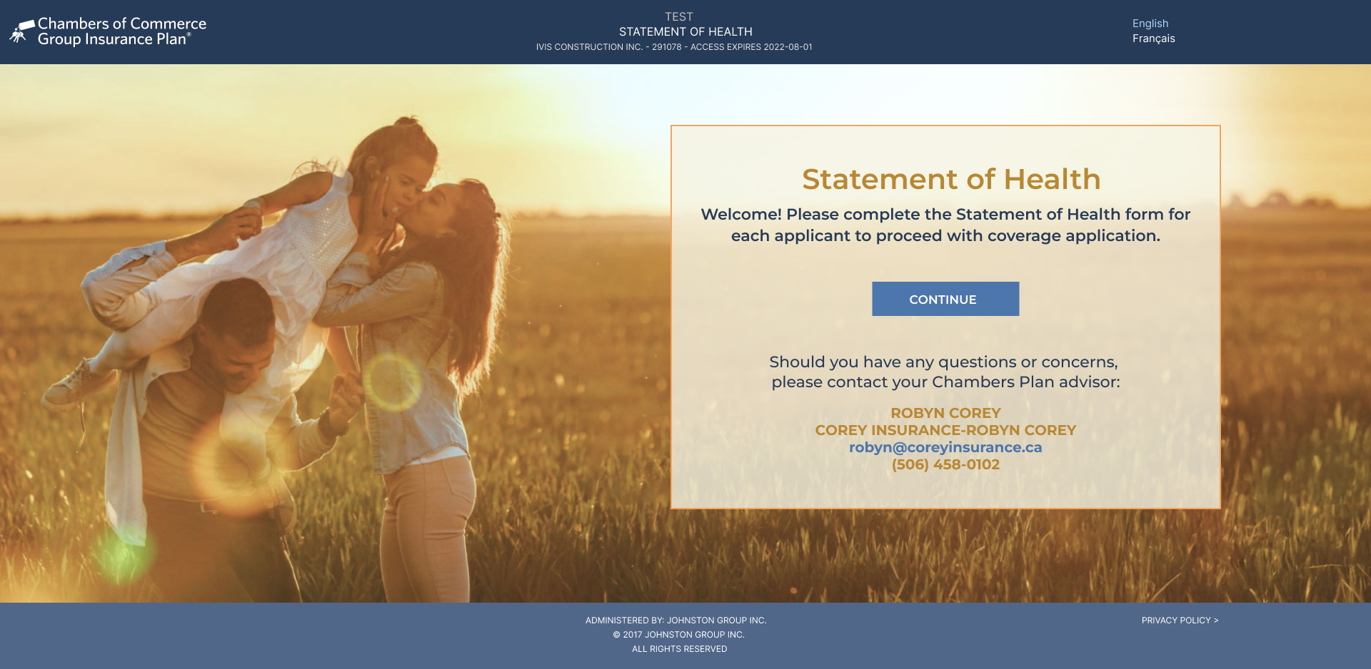
Turning a sensitive, rules-heavy application into a guided digital journey.
The Statement of Health combined employee data, proposed insureds, medical history, lifestyle questions, conditional disclosures, and signatures. The design challenge was to expose enough structure for orientation while revealing only the questions relevant to each person and answer.
Goals
- Transform a complex, rules-heavy form into a guided and understandable journey.
- Support employee, spouse, and dependent logic without exposing unnecessary complexity.
- Make requirements, progress, and completion status consistently visible.
- Clarify medical communication, privacy, verification, and submission expectations.
Expectations
- Help users move through a sensitive task with clear orientation and status feedback.
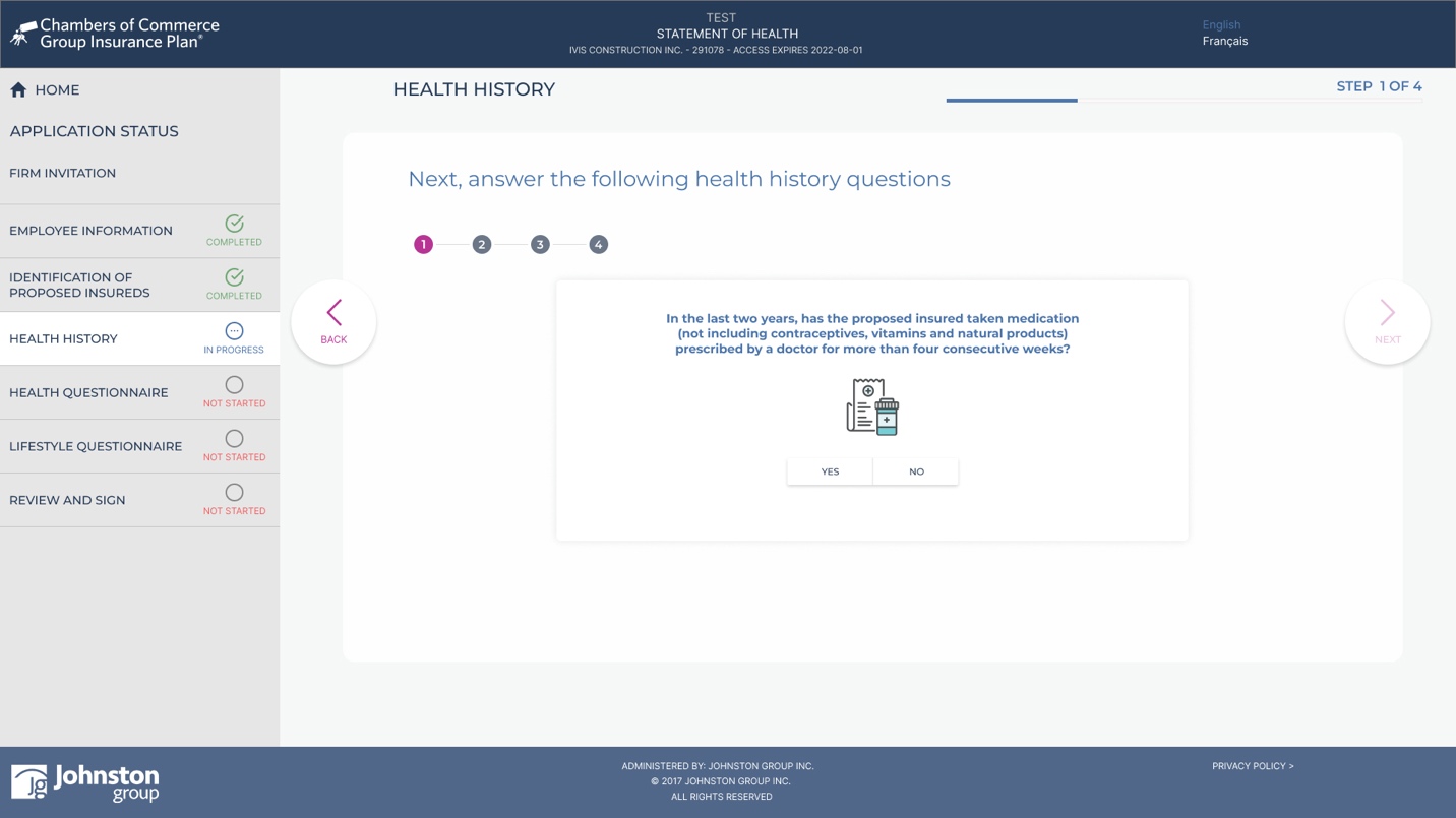
- Reveal conditional follow-up questions at the point they become relevant.
- Use trusted system data where appropriate while clearly identifying required user input.
- Create reusable patterns that could scale across health, lifestyle, review, and signature sections.
Members and dependents completing a sensitive coverage application.
Primary users included employees applying for coverage, spouses and dependents included in an application, and internal administrators who determined who needed to complete health evidence. Members needed clear guidance; administrators needed confidence that the correct people, questions, and completion states were represented.
MVP Strategy
The MVP focused on the behaviours most critical to comprehension and processing accuracy: section status, required completion, dependent-specific responses, and contextual follow-up questions. This made the riskiest interaction logic testable before adding lower-priority enhancements.
Data-Driven Decisions
Design decisions were grounded in business rules, certificate data availability, dependent-selection logic, accessibility requirements, and auto-approval conditions. I prioritized information that directly affected eligibility, completion, verification, and downstream processing accuracy.
The challenge
- Conditional disclosures with dependent follow-up fields and validation
- Multiple proposed insureds requiring distinct responses and completion states
- System-provided data that still required review and verification
- Sensitive medical language, privacy expectations, and accessibility needs
Strategic contributions
- Structured the multi-step information architecture around user goals, completion dependencies, and meaningful section boundaries.
- Mapped conditional logic and person-specific branches to preserve context as questions and required inputs changed.
- Designed persistent progress, status, and completion patterns so users could see what was required, underway, and complete.
- Translated dense business rules, accessibility requirements, and implementation constraints into consistent high-fidelity patterns and annotated flows.
Design rationale
I organized the application around meaningful sections, persistent progress, and contextual follow-up questions. This applied progressive disclosure without hiding the overall journey, allowing users to focus on one decision while retaining orientation and control.
Collaboration and influence
I partnered with business and technical stakeholders to turn policy and processing rules into explicit interaction logic. Flow reviews surfaced edge cases early, while reusable UI patterns created shared expectations for content, accessibility, validation, and implementation.
The form needed to reduce moment-to-moment complexity without hiding the structure, requirements, or consequences of the overall journey.
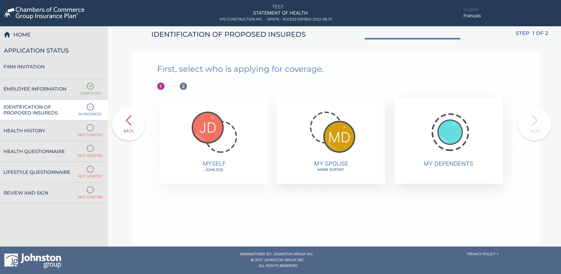
A persistent section dashboard and explicit text-based statuses helped users identify what was not started, in progress, or complete across all proposed insureds.
Designed for clarity during a sensitive and potentially stressful task.
Because health disclosure can be cognitively demanding and emotionally sensitive, accessibility and error prevention were treated as core product requirements:
- Section statuses combined colour with text and icons so progress did not depend on colour perception alone.
- Conditional follow-up content was structured to remain perceivable when dynamically revealed, including for screen-reader users.
- Controls maintained visible focus, predictable keyboard order, clear labels, and consistent error relationships across sections.
- Medical, privacy, and verification language used plain terms to reduce interpretation effort and uncertainty.
Design Process
The work progressed from rules and content modelling to reusable interaction foundations, then to high-fidelity flows for employee information, proposed insureds, conditional disclosures, review, and completion.
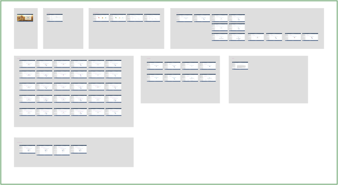
Requirements & Content Mapping
Modelled sections, business rules, certificate data, field dependencies, and conditional content before defining screens, reducing the risk of designing isolated happy paths.
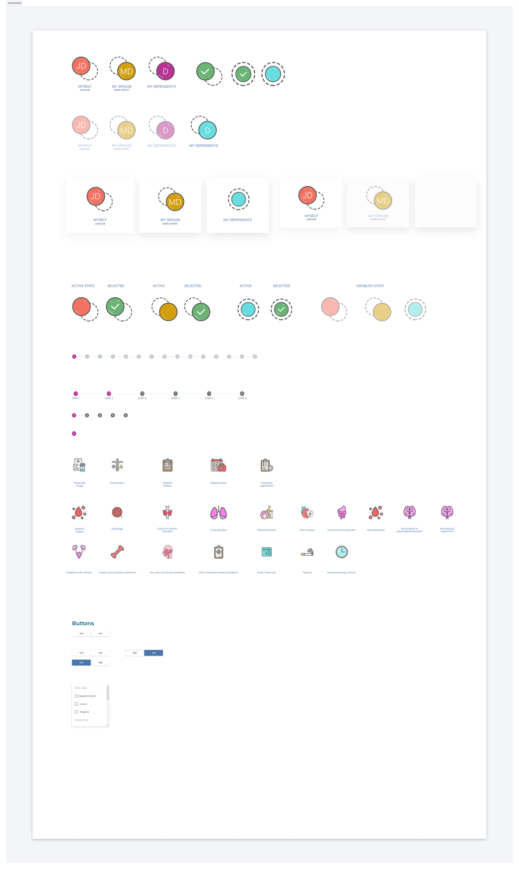
Design System Foundations
Created reusable patterns for applicant status, progress, medical categories, binary decisions, selection controls, validation, and contextual follow-up content.
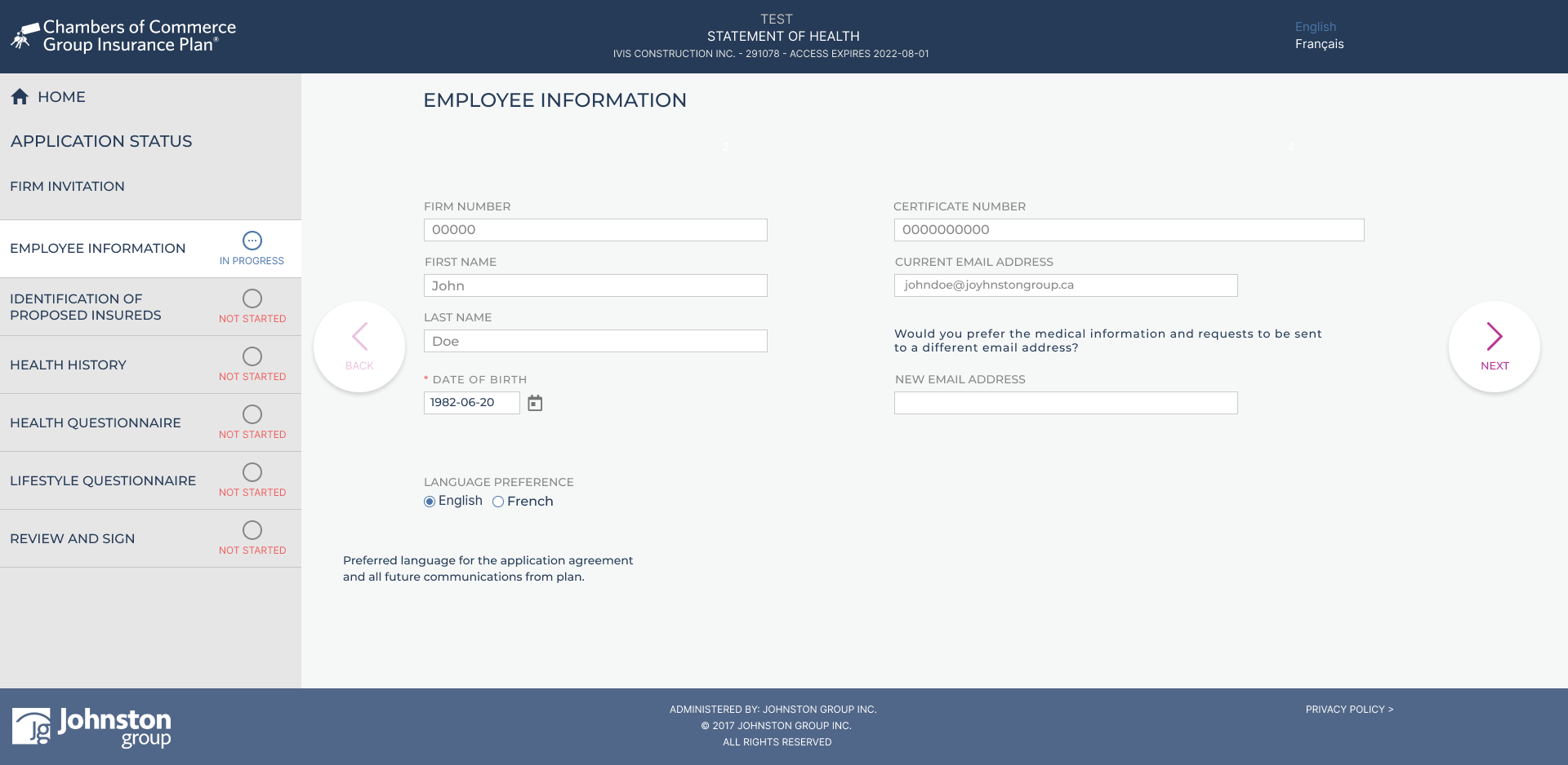
High-Fidelity Flow: Employee Information
Designed a review step that distinguished trusted system data from required user input and made verification expectations explicit before users continued.
High-Fidelity Flow: Proposed Insureds
Made proposed insureds, coverage participation, and person-specific completion requirements easy to identify and compare.
Final Conditional Health Experience
Refined the questionnaire around clear decisions, contextual follow-up fields, visible progress, error prevention, and privacy-conscious guidance.
A reusable architecture for a sensitive, multi-person application.
The design established a coherent model for section grouping, person-specific status, conditional behaviour, review, and submission. It also created reusable form patterns that could improve consistency across future evidence-of-insurability workflows.
How success would be measured
Post-launch analytics were not yet available when I transitioned from the project, so these outcomes represent validated design intent rather than claimed production impact. Success should be evaluated through:
- First-attempt completion and successful submission rates
- Section-level abandonment, backtracking, and validation-error rates
- Support inquiries and processing exceptions related to missing, unclear, or inconsistent responses